Welcome to Redesign Reactions, where we talk about books, covers, and what happens when new cover designs take over a series!
On this edition of Redesign Reactions, let’s talk about
JUST ONE DAY by Gayle Forman!
JUST ONE DAY is one of my all-time favorite books! I adore Gayle Forman, I adore the book, and I actually adore both of these covers! I feel like when the redesign came out for the paperback release, a lot of people were relieved but I didn’t think the original was bad! Let’s take a peek…
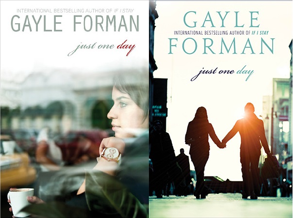
OLD COVER: The original cover for the hardcover release was a picture of Allyson — I’m guessing in a coffee shop of some sort — and I actually appreciated this cover a lot! I like seeing a main character featured on the cover so well — from the hair to the watch — they captured a lot of details on this cover that I thought were appropriate.
NEW COVER: I think the redesign for the paperback release does capture that wanderlust feel much better though. I remember reading on Twitter that a lot of people were so happy this got redesigned and how much better it was for the book, and I do agree that it embraces more of the overall feel. I didn’t think the original was bad though!
Which do I like better? I’m really not sure! I loved being able to get a picture of Allyson on the original cover but I also really love the redesign. The silhouettes against the sunset, the setting, just the feel of it shouts “travel” and I do love it! I guess if I had to choose, I’d go with cover #2! But it’s a pretty close race for me.
So tell me! Which design do you like better? Take the poll below and let me know in the comments which you prefer and why! I’d love to hear your reactions!
[bctt tweet=”Which cover for JUST ONE DAY do you like better: Original or redesign? Take the poll at @bookaddictguide!” via=”no”]


8 thoughts on “Redesign Reactions [3]: Just One Day”
I haven’t read the book yet; however, for some reason I like the second cover better! lol
I LOVED these books! I agree that the first cover does a really great job of capturing the character – especially with the watch. I feel like a lot of covers with REAL people on them don’t always match up to the description of the character inside. Overall I probably like the redesign more, but they both work for me!
I haven’t read the books yet, but I MUCH prefer the redesign. I think it’s one of my favorite covers in and of itself. I love the silhouettes and how they’re walking away from the camera. So pretty. <3
Love this idea, btw!
I need to pick this one up! I love Gayle Forman’s writing. I have read If I Stay and Where She Went. I definitely like the redesign because I really do not like when you see what the characters look like. I like deciding for myself what they look like and not the cover art. Less is always more!
I need to step my Gayle Foreman game up! But I really like the redesign, I like how the two bodies are outlined by the sun!
I haven’t read the book, so I can’t speak to the cover fitting the story. However, the redesign looks like a tweaked clone of so many other books out there with similar covers. The man and woman walking side by side and holding hands. I guess I’ve seen so much of those type of covers, I tend to favor the original.
Ooh, I love this feature! I like how the writing style is very, how do I put this in a good way, very old stylish, like how Danielle Steele has her fonts for her name. 🙂 I like the second cover more, I don’t really like upclose shots like in the old cover, but I’m a fan of couples on covers. 🙂 It does capture the magic of falling in love and traveling so well.
I haven’t read the book yet. I should have it from the library soon. I like the new cover better. I find that actual people on the cover can be distracting. It disrupts my mental image of the character when I’m reading. Am I the only one with this issue?